Monday, August 10, 2009

Technology along with Animation


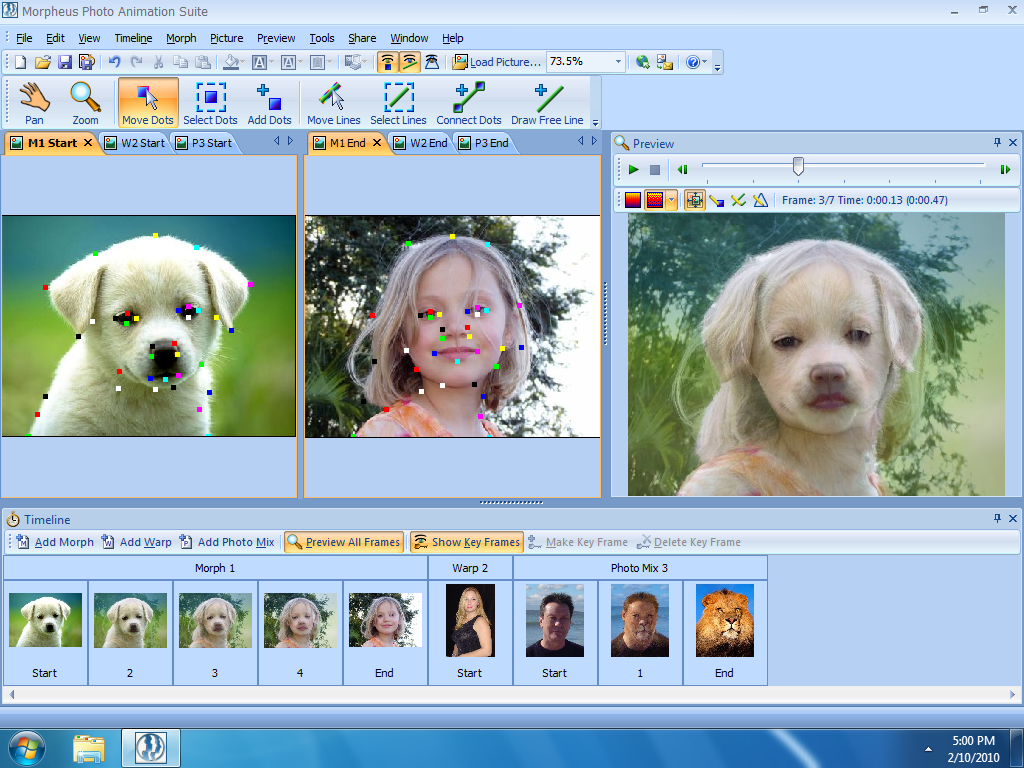
This may be the most interesting insane thing I have seen. I am used to the animation that is hand drawn and scanned into a computer manually one by one and then you time it yourself. I did that in animation classes all through high school designing new patters that a person would walk or how a ball would bounce. The design is the hardest part with that. You are not sure how it will look until you finish. Then imperfections must be picked out by watching. Not even now days just now, for me at least, I found this program called Morpheus Photo Animation Suite. I have never used the program and just saw the screen shot and wanted to talk about it. They take two photos and combine it into one. I wish I would be able to see the design like this in high school. The problem with this though I feel as there is less creativity in the sense of the computer is doing all the work. You just need to approve of the job that it has done. I would be interested in getting this program and using it for a while. Post a new blog in a week or so showing what I can do with my own design from photos that I want to merge. I guess that where the design lies now, the photos you select for the program. In the photo the little girl merged with the dog look like a perfect combination of the both of them being very odd.....enjoy.

TypeFace in Magazine


The typefaces in this Cover from an ESPN magazine, we notice there are different sizes of fonts, colors, and styles. Starting off with the big blue letters for the ESPN across the top portion of the cover shows dominance over the page. It's letting you know what magazine it is and will have a sports related picture usually below it. These fans have FANS written on their bare chest. It is a two tone typeface having an inner layer of white and then and outer layer of blue. This is just a good color to match with the blue denim look and the cover itself. The orange on the top is an eye catcher. Thats the only things that really varies with any degree of color. I look at this before I even look at the cover itself because it stands out so much to me, being color blind. As the articles get larger same with the font on the cover. The next typeface is the size different and color differnence of all the articles that are listed above the ESPN banner. The last would be the magazine info in the bottom corner of the right side.

Blog List


I was looking at the The Design Observer Group today and saw an article that was amazing. I have not checked in on this website as much, where as the next website I talk about the Logo one, are things I always enjoy. This blog site contains many things that do not interest me, but I will give a look just to see what its about and read what people have said. Occasionally I will post a bog usually commenting on other peoples works instead of the work itself. I found the most magnificent photos today. This is a direct quote from the website in a blog "By Adam Harrison Levy
Close to a decade ago, in Watertown, Massachusetts, a man was walking his dog on a rainy evening when, amidst the garbage, he caught sight of a battered suitcase — full of photographs of a bombed out Hiroshima. Tomorrow, August 6th, marks the 64th anniversary of Hiroshima. On this occasion, we present a unique slide show of 100 photographs from the ground in the days after the bombing", here are some of the photos. While looking at this I was in complete awww!!. This website is trying to provide design from all aspects. Chaos and destruction is a process of design. Look at Hiroshima now instead of in 1945. I may start looking at this website more now.
http://www.designobserver.com/


The mission for the website is to show all of the new advertisements companies are using through logos. I have been following this site since we first started class. I have seen all of the new commercials and ideas for things a week before I will see them on television or hear some one talking about it. The most interesting article that was posted I thought happened to be an interview with Paul Rand. This was the third and I would assume final part was the end to his creativity through expressing it in an interview. He is known for his IBM computers, UPS shipping, and ABC television among with many other iconic logos that he had created. I liked how he answered his questions so calmly. He is not very well known but he should be. The overall view of the entire website would be to mention the new ideas and have people comment on the newer stuff usually but things can be post dated back such as this one. This website has even branched out enough to have their own twitter blog account. http://twitter.com/LogoDesignLove I currently just found out about this and am not sure if I want an email every time someone post something.

http://www.logodesignlove.com/

Monday, August 3, 2009

Music - Kid Cudi - Day N Night


Designs aspects of Day "n" Nite music video. The design overall is a basic cartoon and color scheme placed over actual life as it really is. Throughout the video the artist is singing and moving around from place to place. He changes his clothing which is usually animated over depending where he is. A neat example starts at a 1:57 seconds. It shows a DJ doing what they do, and then the tracks turn into pizzas where Kid Cudi grabs a slice. If you have ever seen a Kanye West music video they are very similar.

The music in itself I think has a very good beat. It talks about all day events aka day n night...he then talks about how is lonely and that things will never change. Travis Barker who is a world famous drummer who performs with DJ AM makes an appearance by standing against a brick building. That could be the highlight if you do not like the song.

The two photos above are showing how similar the animation can be in their videos. The top photo is Kid Cudi in this music video and the bottom photo in Kanye West in Heartless. Also this is the link the the Kid Cudi - Day 'N' Nite video, http://www.youtube.com/watch?v=Tln5gGCs1cU. I would place the video on but they don't allow you to add movies that are not files are your computer, having no way of downloading it from youtube.

Great Design Qoutes


"The client is not always right" by Enzo Ferrari. In the book that Enzo wrote, this is one of his most famous lines from it. It just grabbed my attention instantly reading it. The customer is always right I thought?...but if your not the customer and you know you did your best to do what you do the customer like he says may be wrong. Enzo Ferrari, obviously by his last name gives it away, created the race car and sports car the Ferrari. He is an Italian who was a race car driver and a creator. This quote was found online from brainyquote.com, but I only found it here remembering reading it in his book.
My real thoughts are on the quote are that he is totally rite. The client doesn't always have to be rite. I have a business and the customers like to complain a lot but at the end of the day they are always coming back.
The photos above are Mr. Ferrari and a couple of his gorgeous designs.

Thursday, July 30, 2009

Architecture - New Designs


The two homes above are I would say on complete opposite side of the spectrum. The photo on the right was the traditional house that mostly all of us have. Yes, my house is not that big nor nice but this house is a great example of what I want to display. Homes used to be unique and gorgeous having oak wood entry ways with columns and design to themselves. Most of the Tucson homes near campus mostly all look alike depending where you are but all of them have stucco walls and tile or shingle roofs. During I want to say the late nineties and in early into the new millennium style of homes changed vastly for certain areas. My uncle started building a house in a suburb of Los Angeles known as Hancock Park he bought a beautiful crown Victorian style home and demolished in the neighborhood. Due to having no HOA (Home Owners Association), no one did anything. He then built one of these home...a contemporary home. Contemporary homes are known for having cement floors that have been polished along with having box looking furniture. The home itself is usually box in design, having lots of glass and no curves just straight walls that meet at 90 degree angles. These homes are great if you love that style of living. I personally like modern furniture but not the exterior of the homes. They would not mix well with palm trees I feel.
The design has changed started on the east coast with the Crown Victorian Homes then moving westward. The mid-west is known for having farm style home and as we move to the desert areas of the west we find the homes to be more flat and one story or two story instead of the massively tall Victorian homes. The west coast such as California is known for the movement of the contemporary in the United States. A quarter of the new homes that my fathers friend builds back home contemporary.

David Choong Lee - UA Gallery


Yesterday I went and visited the David Lee Art Gallery that is on temporary display in the art gallery at our school. I have never been to an art gallery before this, not knowing what to expect at all. I walk in and see things that catch my eye instantly. The photo above is it, I wanted this for my room the minute I saw this. As I started on the left side of the gallery and walked to the right side I saw the most beautiful things. These paintings were done in little kid paint essentially, I was told by some one who I was with. They pointed out to me the type of paint by how it runs. The art work had a couple ideas that were common. Almost all of the painting were of African Americans if there was a person in the art and if not a reoccurring theme of bubbles on the bottom of every painting and also had these intriguing 3-D looking walls he drew. Most of his art was done cigar boxes and other types of common boxes. This was very fascinating having most artist use a canvas I thought. This photo that I choose above to show, reminded me of the man trying to push everything away. In this piece of art it is layer on layer of parking tickets and no parking signs. The man in the photo I feel is fed up with the whole transit system and I personally found it to be the best piece.