Thursday, July 30, 2009

Architecture - New Designs


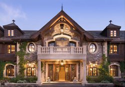
The two homes above are I would say on complete opposite side of the spectrum. The photo on the right was the traditional house that mostly all of us have. Yes, my house is not that big nor nice but this house is a great example of what I want to display. Homes used to be unique and gorgeous having oak wood entry ways with columns and design to themselves. Most of the Tucson homes near campus mostly all look alike depending where you are but all of them have stucco walls and tile or shingle roofs. During I want to say the late nineties and in early into the new millennium style of homes changed vastly for certain areas. My uncle started building a house in a suburb of Los Angeles known as Hancock Park he bought a beautiful crown Victorian style home and demolished in the neighborhood. Due to having no HOA (Home Owners Association), no one did anything. He then built one of these home...a contemporary home. Contemporary homes are known for having cement floors that have been polished along with having box looking furniture. The home itself is usually box in design, having lots of glass and no curves just straight walls that meet at 90 degree angles. These homes are great if you love that style of living. I personally like modern furniture but not the exterior of the homes. They would not mix well with palm trees I feel.
The design has changed started on the east coast with the Crown Victorian Homes then moving westward. The mid-west is known for having farm style home and as we move to the desert areas of the west we find the homes to be more flat and one story or two story instead of the massively tall Victorian homes. The west coast such as California is known for the movement of the contemporary in the United States. A quarter of the new homes that my fathers friend builds back home contemporary.

David Choong Lee - UA Gallery


Yesterday I went and visited the David Lee Art Gallery that is on temporary display in the art gallery at our school. I have never been to an art gallery before this, not knowing what to expect at all. I walk in and see things that catch my eye instantly. The photo above is it, I wanted this for my room the minute I saw this. As I started on the left side of the gallery and walked to the right side I saw the most beautiful things. These paintings were done in little kid paint essentially, I was told by some one who I was with. They pointed out to me the type of paint by how it runs. The art work had a couple ideas that were common. Almost all of the painting were of African Americans if there was a person in the art and if not a reoccurring theme of bubbles on the bottom of every painting and also had these intriguing 3-D looking walls he drew. Most of his art was done cigar boxes and other types of common boxes. This was very fascinating having most artist use a canvas I thought. This photo that I choose above to show, reminded me of the man trying to push everything away. In this piece of art it is layer on layer of parking tickets and no parking signs. The man in the photo I feel is fed up with the whole transit system and I personally found it to be the best piece.

Sunday, July 26, 2009

Miltan Glasser Film


I watched a film about Miltan Glasser. The film starts with him introducing himself and leads into him speaking about art and design. While this is going on the visual are occupied with posters that he has made. One of them is on the one above in the photo. He speaks about how a designer is part business man part artist, and every designer lies different on that balance beam. Miltan believes that arts acts as a pacifist to any culture while also being a gift.
Mr. Glasser started teaching so he could affect the lives of others. Talking about teaching and helping others, he goes into talk about being elderly in life. When you get older what you love to do usually doesn't sustain you anymore he believes. By not having what you love anymore the astonishment factor leaves also. Through art he believes that he has been able to keep doing the things he loves; teaching and designing. Things still astonish him, which he made a big deal about.
I started to watch three different of the artist films at that website and got bored within the first thirty seconds of them. This is the only one that kept my attention for the first thirty seconds, let alone the next six and a half minutes. The film is located here http://www.hillmancurtis.com/index.php?/film/watch/milton_glaser/. This film was directed and filmed by Hillman Curtis.

Friday, July 24, 2009

Conservation through Design.


Energy Star Appliances are saving our environment. As shown in the picture, they are advertising that you will save up to 20% a year in your electric bill just for this one appliance. These appliances that energy star has approved are lighter, faster, and better quality products now. The washer and dryers that they have given their approval to all have the new futuristic design look. With large open plexiglas windows so you can look in at your laundry. They also sit a lot higher than traditional non approved appliances. The new design has obviously help lead to the association between that and being more energy efficient. One of the best parts is that the smaller items they make are more powerful and take less energy. I want to know more about the design of the products that they endorse. I wonder what qualifications make it allow to pass the list and get the famous sticker. They place small tiny stickers on any product that is endorsed. Going farther along with conservation and design new automobiles such as the Toyota Prius Hybrid it pollutes the environment less and has the new futuristic look. The new look of the future is conservation. Especially with the times right now everyone is looking to save, and they can do that with the new more enviornment friendly cars costing less every year in production. I feel though to help our economy we can't conserve, everyone needs to start spending again.

Bruce Mau - __________ & stay up late


After reading the Incomplete Manifesto on Bruce Mau website www.brucemaudesign.com, I realized that there were two that caught my attention the most. The odd thing was that they were right next to each other. I choose number 17. ______________, this is the one that is supposed to be left blank. Bruce Mau says that "Intentionally left blank. Allow space for the ideas you haven’t had yet, and for the ideas of others." To me this one popped out of the screen because it did not have a title. Then reading I realized this is so important. I find it useful to design and creating projects, allowing us to more easily create ideas. There are always ideas that have not been thought of till mid-way or even the end of the project or design. Having this Bruce Mau allows more creativity throughout any task. The next one is number 18. The title is Stay Up Late, he explains this means "Strange things happen when you’ve gone too far, been up too long, worked too hard, and you're separated from the rest of the world." Mr. Mau is saying if your staying up working that hard it should pay off in a strange way. For future design, you may have that great idea when you are just alone late one night doing work. It will pay off, who knows. I have personally experienced and know why Bruce thinks this way.

Sunday, July 19, 2009

Graffiti - What do you think?


When you are driving in your car or on the subway, you may notice when you look out on buildings or on walls you will see this art form. This art form is called Graffiti and is considered to be illegal if it is happened to be drawn on public or private buildings and walls. I remember two weeks ago taking the Amtrak from New Jersey to Delaware. Looking out to the left and right all I saw was this graffiti. Some of it vulgar and disgusting other times beautiful and enlightening. I saw gang signs drawn all the way to butterflies and everything between also. In this photo the man is drawing a beautiful colored image over some other graffiti that most likely was not as nice to look at. Lots of this art form is associated with gangs calming their territories by marking building with certain words or symbols to let others that they are not welcome. There is a graffiti cleanup team working all over mostly ever city in the United States trying to clean up the property damage that has occurred. I personally think the style of graffiti is amazing but not on buildings. It just looks tacky and unprofessional. When the art is done on a painting or done on a building for a cause, it always happens to look better. The worst and most vulgar graffiti always happens to take place in male restrooms I would assume over women restrooms. Almost every man’s restroom, even nice restaurants and upscale places will have some graffiti someplace in the bathroom. This is the type along with having stuff all over buildings is disgusting but it can be beautiful if used in the right way.

Graffiti happens everywhere what do you think about it?

Visual Metaphors


In this photo we have all of the people from the Campaign Race of 2008. In the bottom half of this photo we have our current President Barrack Obama. He is dressed up in a suit of armor fighting off Hillary Clinton. They both are on their knee's looking exhausted. While John McCain is standing on the top of the bluff looking down at Clinton and Obama battling to the death it looks as. Next to McCain stands an Elephant showing how the Republican Party is united as one instead of the conflict between the Democratic Party. During the whole campaign Hillary Clinton and Barrack Obama were just taking swings at each other in the media. Clinton would talk about how Obama was not qualified and he would fire back with some things in the same sense trying to put down Hillary. This started from the first day of the 2008 and made people sick of watching the news due to it was just them not being able to settle on topics, instead of having always both sides. The quote from the McCain cartoon talks about how we won’t need his lance to battle anymore but instead just a broom. The artist of this cartoon shows how when two people of the same party battle within, that the other group will come out ahead. McCain should have only wished that this would have been the case though. Once Obama was nominated to run against McCain and Clinton lost that opportunity she was instantly a huge supporter of Obama. Making McCain now the only target for both of them now, maybe he should be grabbing his lance.

Pearl Harbor Propaganda

This poster dates back to World War II. The Japanese on December 7, 1941 flew their planes knowing there would be no return due to the lack of fuel, bombed and ”kamikaze" meaning made their planes into bomb essentially flying them into the ships at the harbor. This poster shows the Americans as "Uncle Sam" on the bottom of the photo with his first in the air. This would give the American people hope, knowing that the statement below him, "our bullets will do it" saying let's go to war. As we see above him are the words essentially, let's go to war. The art work in this photo is grabbing your attention by having the bold defined body of "Uncle Sam" looking up at the "kamikaze" planes knowing that America will be getting even. Propaganda such like this got everyone in America to back a common cause. These poster help sway generations at a time, being able to target separate demographics with different photos and words displaying the similar message. In today society the government has changed it views on how to display that propaganda. Posters won't even keep anyone’s attention for more than a second or two, not even enough time to read and understand what is going on. Now the military and government have these awesome commercials that get people hooked on the subjects. Though the artist and people in this era I feel were a lot more creative coming up with these witty posters and usually there was very funny political cartoons that associated themselves, sometimes being the same artist.


Thursday, July 16, 2009

Hi guys.

I am new to this. This is fun and creative